
The Donor Strategy Series: Part 4 – Naming & Tiers That Work
From Stewardship to Structure
In Part 3, we explored how donor recognition continues long after installation through stewardship and care. To make that stewardship sustainable, you need clear rules that make updates fast and predictable. That’s where tiers and name formatting come in – the framework that keeps recognition organized, consistent, and easy to maintain.

Why Tiers Matter
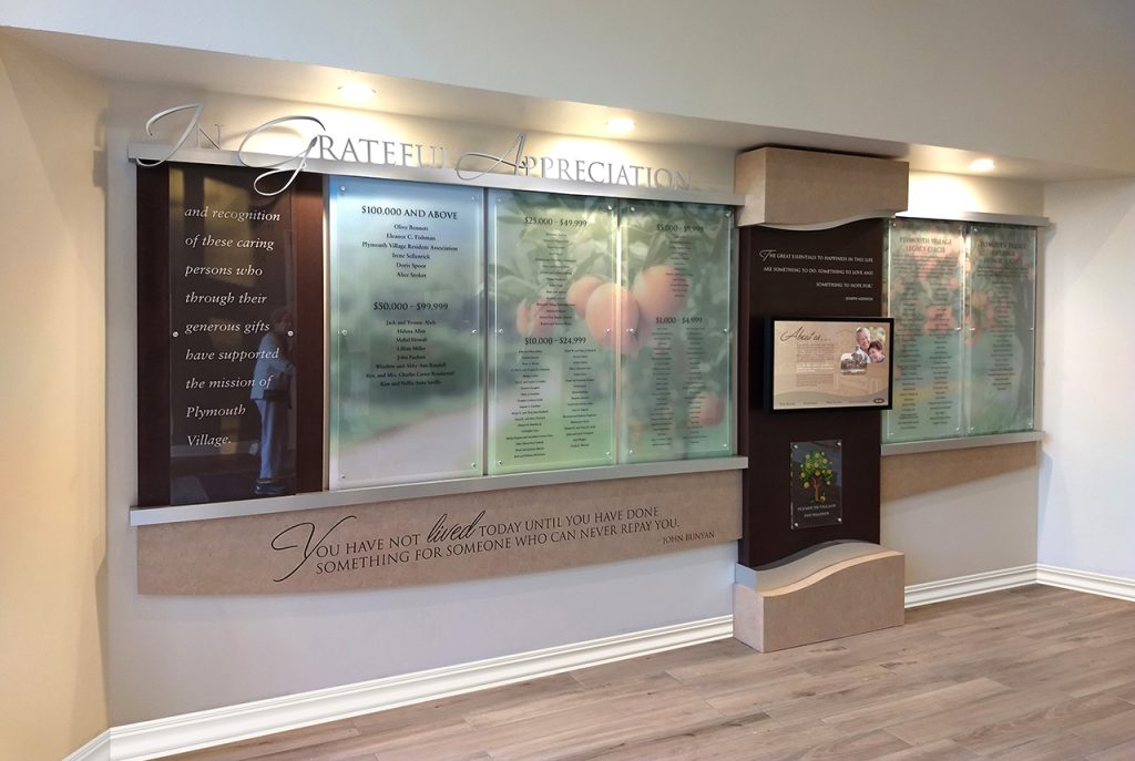
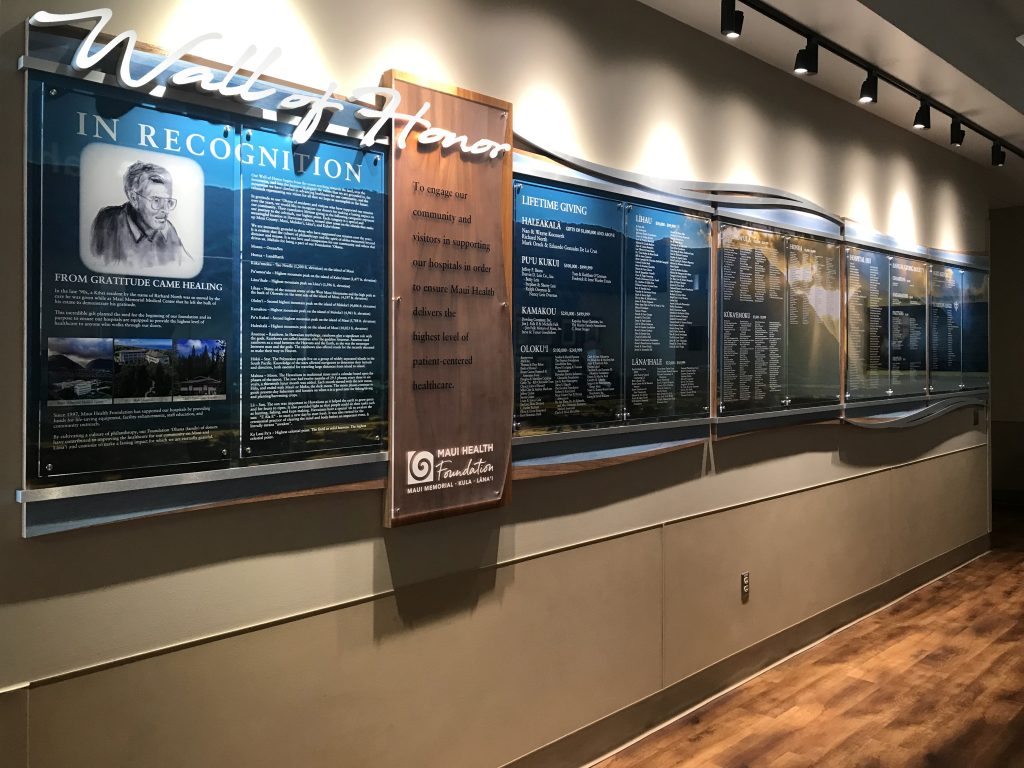
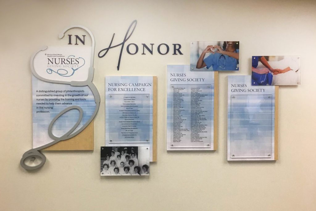
Clear giving tiers do more than sort names by amount, they set expectations, motivate participation, and make donor recognition easy to understand at a glance. When tiers read naturally and make sense, they build confidence in your campaign. When they’re confusing or inconsistent, they slow decisions and create exceptions that complicate updates later.
A clear tier structure also helps donors understand where they fit and how they can grow their giving. It turns recognition into an incentive, not just an acknowledgment.
Designing Tier Architecture
Start with tiers that feel balanced; simple enough to be understood quickly but detailed enough to reflect your giving culture. Avoid too many levels or steps that feel too similar. Give each tier a distinct visual treatment through size, spacing, or layout so hierarchy is obvious without over-explaining.
For naming the tiers, use language that reflects your organization’s personality and mission. Mission-centered titles often resonate more deeply than generic labels. For inspiration, explore Gift Club Names for examples you can adapt while maintaining consistency across donor recognition displays.

Name Formatting and Consistency
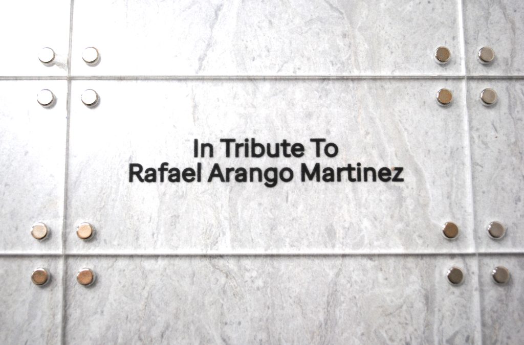
Decide how names will appear and write those guidelines down early, then keep them consistent. Will you use full names or first initials? How will families and couples be listed? How will “in honor of” or “in memory of” lines appear?
Documenting these details eliminates confusion later and ensures updates are handled the same way every time. The goal is for your recognition to read cleanly, evenly, and with respect for each donor’s contribution.
Readability and Accessibility
Donor recognition succeeds when it can be read easily by everyone. Use clear fonts, good contrast, and spacing that supports readability from a comfortable distance. For digital pieces, design with accessibility in mind – text size, color contrast, and screen readability all matter.
Readability is part of respect. It shows donors their names and stories are meant to be seen and appreciated.
Planning for Growth
Growth should feel planned, not patched. Build in room for additional names at every tier, and decide in advance how overflow will be handled.
Flexible systems like PIR’s Clear Change System, ClearTech System, and Magtech System make updates simple while keeping the look consistent. Decide when new tiers can be added or when older ones should be consolidated, so your recognition grows naturally with your donor display.
How Partners In Recognition Helps
At Partners In Recognition, we help development teams plan tier structures and name formatting that scale gracefully. Our conceptual artwork and quotes show how your tiers will look and function before fabrication begins, so every name and level is clear from the start.
We guide teams through every detail: tier hierarchy, naming conventions, readability, and future expandability. The result is recognition that’s organized, elegant, and ready to grow with your mission.

A Confident Framework
When tiers are clear, policies consistent, and updates planned, recognition becomes a steady part of stewardship. It’s easier to talk about gifts, simpler to honor them accurately, and more inviting for future donors deciding where they belong.
The next step is ensuring all that careful planning comes together beautifully – from fabrication to installation – in Part 5, Finishing Strong.
The Donor Strategy Series is created by Partners In Recognition to help development, advancement, and campaign leaders plan and execute recognition that inspires, endures, and celebrates generosity.