Blog 2: Trauma-Informed Donor Recognition Design: Creating Comfortable Spaces
Before someone reads a single donor name, they notice the display itself. They see its scale, color, reflections, lighting, and relationship to the room around it. That first impression matters, particularly in spaces where people may already be dealing with stress. Trauma-informed donor recognition design takes these factors into consideration, helping create displays that feel comfortable and welcoming within their surroundings.
This is where trauma-informed healthcare design becomes practical. It encourages organizations to consider the sensory experience of recognition, not just the content printed on it.
Give the eye a place to rest
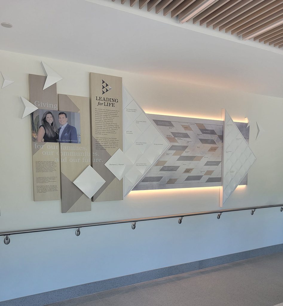
Donor walls tend to collect information over time. Names, giving levels, campaign messages, logos, photographs and stories can all compete for the same square footage. When every available area is filled, the result may technically include everything the organization requested but still feel busy.
Spacing is one of the simplest ways to change that experience. A little more room between groups of names, a clean area around a campaign message or an intentional break between materials can help people understand the display more quickly.
For PIR projects, open space has another advantage: it often gives the recognition program somewhere to grow. A wall does not need to look unfinished simply because capacity has been built into it. When future space is incorporated into the composition from the beginning, it can look intentional on day one and still work years later.
Consider room finishes in trauma-informed healthcare design
A material sample viewed on a desk can behave very differently once it is installed in a bright lobby. Highly polished surfaces can pick up ceiling lights, windows, movement and reflections from across the room. In the right setting that may be desirable. In another, it can add more visual activity than expected.
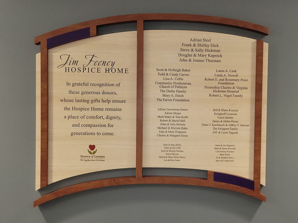
Matte and satin finishes, frosted acrylic, wood or wood-look materials, softly textured surfaces and layered panels are all options that can reduce reflection and add warmth. The right choice depends on the architecture, maintenance requirements, brand and the way the room is used.
Rather than starting with a list of materials considered “trauma-informed,” we think a better approach is to ask what the room already feels like and what the display should add to it.
This display for Hospice of Lenawee blends well into their environment.
Use color without letting it overpower the environment
Trauma-informed design is sometimes reduced to the idea that every space should use quiet blues, greens and neutrals. Real projects are more complicated than that. Organizations have brands. Children’s spaces may intentionally use energetic color. A bold accent may be exactly what makes a display feel connected to the facility.
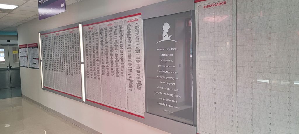
The useful question is one of proportion. A strong brand color can be an accent instead of covering the entire installation. Several colors can be organized so the wall still feels clear rather than chaotic. Neutral does not automatically mean calming, and bright does not automatically mean stressful.
Color works best when it supports both the identity of the organization and the mood of the surrounding space.
Shape changes the personality of a display
A grid of rectangles can feel precise and architectural. Curved panels, rounded edges and organic forms can make the same amount of information feel very different. Neither approach is universally better.
In a clinical environment dominated by straight lines and hard surfaces, a softer form may provide some visual relief. In a highly contemporary lobby, a clean geometric system may be exactly right. As with materials and color, the form should respond to its setting rather than follow a formula
Plan lighting early in trauma-informed donor recognition design
Lighting has an enormous effect on donor recognition and is easy to underestimate. A finish that looks beautiful in a rendering may become difficult to read under a downlight. A dimensional name can cast a dramatic shadow at one time of day and disappear into glare at another.
Where appropriate, diffused or integrated lighting can create a softer effect than a strong spotlight aimed directly at the display. Backlighting can also provide dimension while helping the recognition feel connected to the architecture.
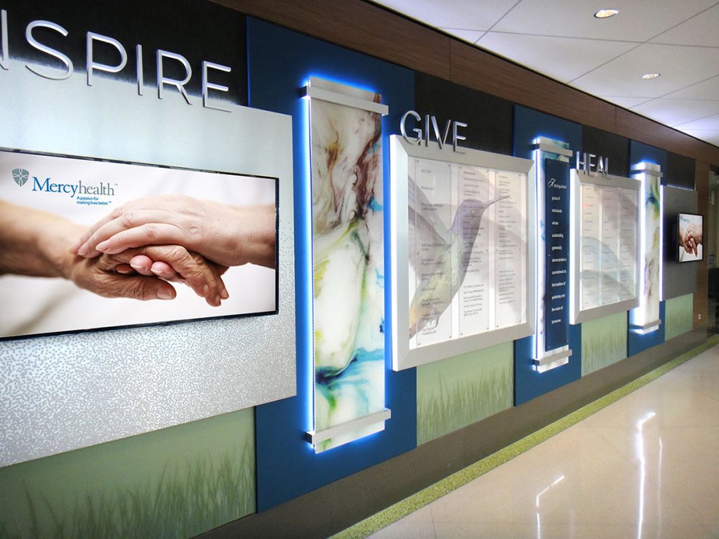
The important part is to consider lighting while the display is being designed. Waiting until installation to discover reflections, hot spots or unreadable names limits the options for correcting them.
Work with natural light instead of automatically covering it
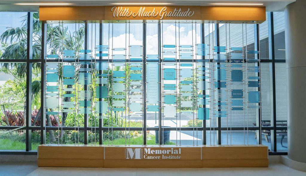
Some of the most interesting recognition opportunities are in front of glass, near windows or beside views that people already value. A conventional solid wall system may not be the best answer in those locations.
Suspended components, translucent materials, open frameworks and layered elements can allow recognition and natural light to share the same space. In some cases, keeping a view open is more important than filling every inch with donor information.
The display should be part of the room, not a separate event
Good donor recognition can be memorable without overpowering the space around it. It can use beautiful materials, dimensional construction, lighting and storytelling while still respecting what is already happening in the room.
This balance is especially valuable in trauma-informed healthcare design. Instead of asking only how to make recognition command attention, it is worth asking what kind of presence the display should have in that particular setting.
Often, the most successful answer is a display people notice because it feels naturally connected to the place where it lives.
This is the second blog of a three-part series exploring how trauma-informed donor recognition design can influence the experience of everyone who encounters a display.